It is not like picking what to have for breakfast. Or what shoes to wear. Or whether to have a walk down at the waterfront, or go through the park instead.
No, this decision will last for years. The decision? Our new corporate logo.

Since starting at ISA two years ago, one of my goals as Marketing Director has been to modernize our communications, and bring more insightful content to our customers, staff, and prospects alike. ISA has been a leader in the cybersecurity field for nearly three decades (29 years this month!). My first mission was to update our company’s name from Information Systems Architects Inc. to ISA Cybersecurity Inc., and to launch a brand-new website in September 2019. Then, during the pandemic, I have been keen on bringing our logo up to date. We’ve certainly got a lot of mileage out of our “classic” ISA logo; it’s been with us since the ‘90s.
To kick-start the process, we conducted a set of interviews with people inside the office and out – customers, staff, partners, and trusted experts – to get a sense of their views on the ISA brand over the years, and what they wanted to see in a new logo.
“We wanted to create a logo that brings a sense of calm professionalism. A logo that is personable and engaging, and shows trust. In short, a logo that reflects us.” – Julie Vi, Director of Marketing
The design firm brought us exciting ideas – some we loved, some we questioned, and some that we were on the fence about.
But over the course of a few months, and through a series of revisions and refinements, we feel that we have created a winner. Introducing, ISA’s new corporate brand identity and logo: a fresh look, but with the same customer-first philosophy.

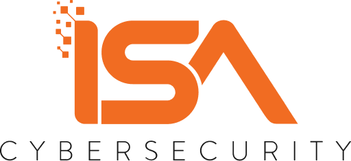
The first thing you will notice about the new logo is that we changed it from dark blue to orange (that’s Pantone 1505C, for you design geeks!). We chose the logo colour and simple, bright, and bold graphics to convey the light we shed on the complex cybersecurity landscape. We kept some elements of the colour blue throughout our branding elements to reflect our heritage, our professionalism, and our stability.
You will also notice that there are pixels at the top left of the logo; these represent the disparate input data – ideas, questions, challenges, opportunities – that flow through us via the “I” in the logo. Our experienced teams process the ideas and provide services and solutions that best suit our clients’ needs. The achievement and accomplishments from our teamwork are revealed in the “A”, where we strive for excellence in delivering services and consultation that are second to none.
I hope you love our new logo as much as I do. You will be seeing lots more of it in the days, weeks, and months to come, as it gets integrated in our corporate materials, correspondence, website and more as we head deeper into 2021. Leave a comment on your thoughts on the logo – I would love to hear your feedback!
And since I still can’t decide on what to have for breakfast… I’ve decided to do a LinkedIn social media sweepstakes to give away something I enjoy doing… shopping. One lucky winner will be selected randomly to win a $500.00 CAD gift card to shop at their favourite online merchant (choose from Amazon, Best Buy, or GoodFood)! Enter our ISA Rebranding Sweepstakes, for a chance to win! And be sure to share with your friends and family!
Is your organization looking at rebranding? Make sure that you consider the cybersecurity implications of this big change. Cybersecurity matters, and you need to know why. Read more here.

